


Autor: mugalde
Nuevo logotipo Eco Hotel Rural Angiz
Nuevo logotipo Eco Hotel Rural Angiz
El Hotel Rural Angiz situado en el barrio de San Bartolomé de Busturia (Bizkaia) inicia una nueva andadura y para ello estrenan logotipo.
![]()
Kit casero para letterpress
Kit casero para letterpress
http://nicefucking.graphics/kit-casero-para-letterpress/


Brit + Co tiene a la venta un interesante kit casero para hacer letterpress de forma sencilla que incluye todo lo necesario, desde una pequeña prensa, todas las herramientas necesarias hasta papel, tintas y placas con algunos diseños prediseñados. Creo que lo interesante aqui sería mandar a hacer nuestras propias placas e utilizar esta máquina para imprimir. Si les interesa este producto lo pueden comprar online por $220 USD.
https://www.brit.co/shop/catalog/letterpress-ultimate-kit_34060/
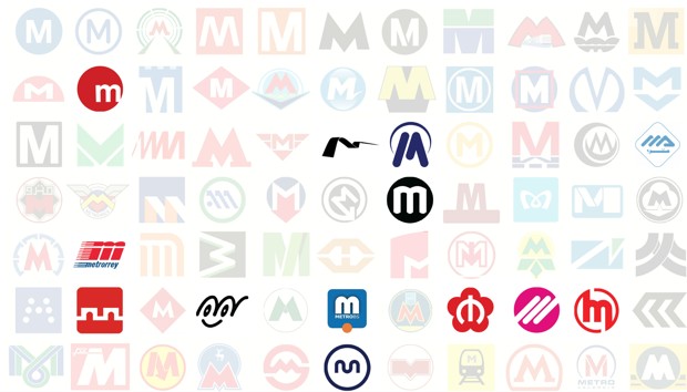
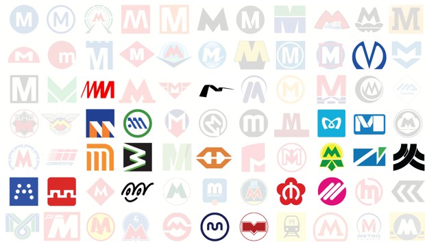
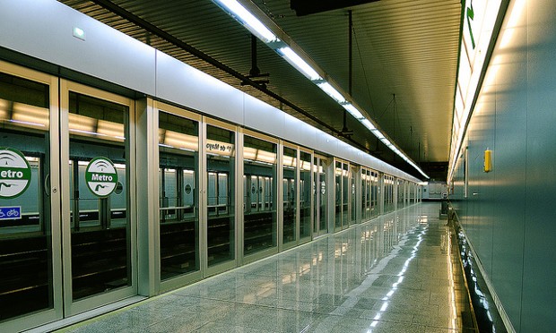
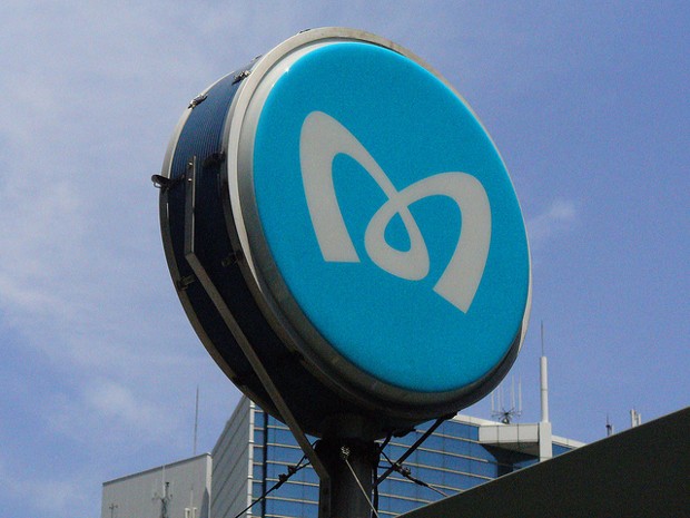
77 maneras de diseñar la letra «M»
77 Ways to Design the Letter ‘M’
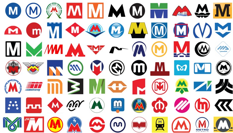
The universal symbol for a city’s Metro system is a big “M.” If you see one, wherever you are, you know what to do. It’s like the world got together and agreed on a Bat Signal for mass transportation.
But transit agencies also go to some great lengths to render the letter in a way that’s uniquely theirs. With the help of the Metrobits blog we’ve identified at least 77 different M logo designs that are currently (or were recently) in use—gathered here in no special order (and listed in full at the bottom of this post). Considering that an M consists of a mere four straight lines, the group is a pretty impressive feast of diversity.
You’ve got floating M’s. Squares and circles and other geometric backdrops. Tiny notches or flairs. Rather outrageous flourishes. Capital and lowercase M’s alike. There are lots of allusions to motion: from tracks to tunnels to a train itself. Several arrows point downward, in what’s hopefully not meant as a reflection of ridership trends. There are animal cameos, including what seems to be a goat. Several M’s have been given wings in some sort of transport-related identity crisis. M’s are made of both dots and single wavy lines. Abstractions abound. One M is an emoticon. Another is shaped as a heart, in a nod to loving service. Another really looks as if it’s wearing a snug pair of green and yellow undies.
To gain insight into why a transit agency would bother to put so much effort into its M logo, we turned to whiz graphic designer Michael Bierut of Pentagram. His initial response: maybe they shouldn’t. “I think it’s all part of some full-employment program for graphic designers,” he (half) jokes.
Pressed for a stronger rationale, Bierut wonders if metro agencies embellish the M logo to show the public that their transit service goes beyond the bare minimum. “That it isn’t just: we work for the government and can’t afford anything but the M that comes out when you press the button,” says Bierut. “This sort of implies the promise of other exciting extras that might happen.” But he cautions that this extra design effort won’t go very far if the system itself doesn’t deliver.
“No matter how good logo is, people will come to associate that logo with an unpleasant experience,” he says, “and it’ll all be for naught.”
After studying these 77 M’s for far too long, a few natural categories emerged.
Sticking to the Basics
A few bold M logos quit while they’re ahead. They use a pretty basic font, and perhaps arrange the letter against a circle or a square (or maybe both), then call it a day. The Washington Metro “M” is a great example of doing more with less: big white block M, black background, done. The Helsinki, Paris, andBaltimore metros, as well as all those in Italy, are similarly minimalist.
“If you do it with enough confidence,” says Bierut, “people will figure it out.”
Bierut says the first thing he would do if tasked with designing a metro transit M is reconcile it with other signs in the system. Take the logo for the Metropolitan Transportation Authority (which didn’t make our cut because it uses all three letters: MTA). The circle gives a hint of a tunnel, but it also matches the circular backgrounds of the individual numbered and lettered lines of the subway system.
“I would say that consistency is more important than cleverness,” says Bierut. “Consistency is actually really hard to achieve. Cleverness is a cheap commodity.”
Slight Tweaks
Some metro agencies take the basics just a wee step forward. Maybe it’s a seemingly arbitrary notch (or two or three) through the letter, as in the L.A. Metro’s new logo, or those in Amsterdam and Santo Domingo and Miami. Maybe the M is set to the side of a background, as is the case for Lisbon. Maybe it gives the impression of being slightly elevated, as does theRotterdam metro, whose logo might be mistaken for a superhero emblem.
Bierut says there can be value in creating slight tweaks that people come to associate with a specific metro M. (Among other things, it ensures that other public agencies using the logo ask for the official version instead of popping in any old M they see as similar.) Distinctiveness doesn’t take much to achieve, he says, and the recognition value it produces might be worth the small effort.
“I think one of the tricks with doing that sort of modification is that sort of designates that M as the official M, even if it doesn’t really mean anything beyond that—even if it doesn’t have any actual semantic value,” he says.
Lowercase or Rounded Letters
Several M’s avoid the limits of four straight lines and three sharp points by using a lowercase letter. Valencia, Spain, is a prime example here, though Monterrey, Mexico, and Brescia, Italy also go little with their M logos. “I think lowercase M’s are meant to feel a little less stentorian,” says Bierut. “They’re yelling at you a little less, perhaps.” That’s certainly true of the Naha (Japan) logo, which turns a lowercased M into a smiley face.
Bierut points out that the rounded elements of the lowercase M also provide a chance to echo the nature of a certain transit system. “If it goes through a subway or goes over an arched bridge, or things like that, you could argue it has some direct picture of the thing it’s depicting, to a certain degree,” he says. Take a look at the Rennes, France logo, for instance, and see if you can’t detect the hint of two tunnels.
Motion
The potential depiction of tunnels or the like by lowercase M’s speaks to the broader theme of motion going on in lots of these logos. Some of these references couldn’t be more literal: Daejeon (South Korea) includes a train outline, and Xian (China) looks less like an M than an underpass. Others are a bit more indirect; the M’s for Baku Azerbaijan and Novosibirsk in Russia move through subway tunnels, while those in Mexico City and Recife, Brazil, seem made of tracks.
Two sub-classes of motion M’s take the concept of movement into unexpected directions. Several M’s have wings, Prague and Bucharest among them, which somewhat awkwardly reminds people how much slower trains are than planes. The Dnepropetrovsk (Ukraine) M, meanwhile, is arguably resting on a cloud. Still other metros pair the wonders of urban rail technology with … remote wildlife. Looking at you, Samara (Russia) goat and Nizhny Novgorod (Russia) deer.
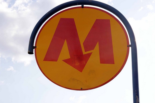
Arrows are another recurring theme related to motion—uniformly pointing underground, just in case you didn’t know where the metro ran. Sofia (Bulgaria), Warsaw (Poland), Lille (France), and Istanbul (Tukey) are among the M logos that come with their own wayfinding guides.
Abstract
A number of M’s reach another level of design. Saint Petersburg’s M kind of looks like the logo for Dracula. The squiggly Malaga metro does a nice job depicting increasing speed as well as an M. The swoosh M of Seville, Spain, in addition to being a perfect example of how a novice should draw a seagull, has an elegance to the motion it suggests. The sideways M of Medellin, Colombia, rather unfortunately conjures imminent derailment. Athens, Greece, does a beautiful job turning the first slope of its M into an A. The Brussels M could be seen as a ribbon of flowing track. The Perugia (Italy) logo may or may not have been inspired by a dot matrix printer.
Bierut suspects one reason some transit agencies feel the need to push the envelope on their M design is they feel a need to compete with the corporate dollars shoveled into automobile marketing. “I think that for a lot of these public agencies, there’s an impulse, which may be justified or may be gratuitous, to mimic the way a private sector company would behave,” he says.
That’s not to say it never pays off. It’s no accident, for instance, that the Tokyo Metro M loops toward closure at the bottom, as if trying to form a heart. Theagency says the design “reminds us that we serve the heart of Tokyo with thoughtful, heartfelt service.” Bierut says as a graphic designer he “really likes that sort of thing”—the extra step that makes a logo memorable.
“You get distinctiveness by doing anything,” he says. “Then if you wanted to make it memorable and appropriate, making that point of distinction plausibly mean something is the next step.”
Let’s just hope the fine folks at the Kiev metro, with their underwear logo design, weren’t going for meaningful symbolism.
Logos in top graphic (left to right):
Row 1: Baltimore, Paris, Baku, Genoa, Helsinki, Kryvyi Rih (Ukraine), Los Angeles, Miami, Kharkov (Ukraine), Dneprovsk (Ukraine), Newcastle.
Row 2: Lyon (France), Valencia (Spain), Amsterdam, Barcelona, Almaty (Kazakhstan), Rio de Janeiro, Rotterdam, Rouen (France), St. Louis, Saint Petersburg, Sofia (Bulgaria).
Row 3: Washington, D.C., Yekaterinsburg (Russia), Malaga (Spain), Tblisi (Georgia), Prague, Seville, Santo Domingo (Dominican Republic), Toulouse, Wuhan (China), Chiba (Japan), Algiers.
Row 4: Cairo, Bucharest, Brasilia, Athens, Istanbul, Budapest, Rennes (France), Copenhagen, Tokyo, Brussels, Tashkent (Uzbekistan).
Row 5: Novosibirsk (Russia), Monterrey, Mexico City, Medellin, Maracaibo (Venezuela), Manila, Lisbon, Lille, Kiev, Valparaiso (Chile), Recife (Brazil).
Row 6: Perugia (Italy), Xian (China), Ankara (Turkey), Naha (Japan), Kazan (Russia), Brescia (Italy), Samara (Russia), Nanjing, Lausanne (Switzerland), Hangzhou, Marseille.
Row 7: Fortaleza (Brazil), Catania (Italy), Warsaw, Nizhny Novgorod (Russia), Shanghai, Porto, Minsk (Belarus), Daejeon (South Korea), Moscow, Valencia (Venezuela), Liverpool.
Logotipo DINAMIKAK
![]()
Muchas gracias Alberto por confiar en mí.
¿QUÉ ES DINAMIKAK?
ALBERTO ETXEANDIA
Madrugar es un placer…

Fotos matutinas.
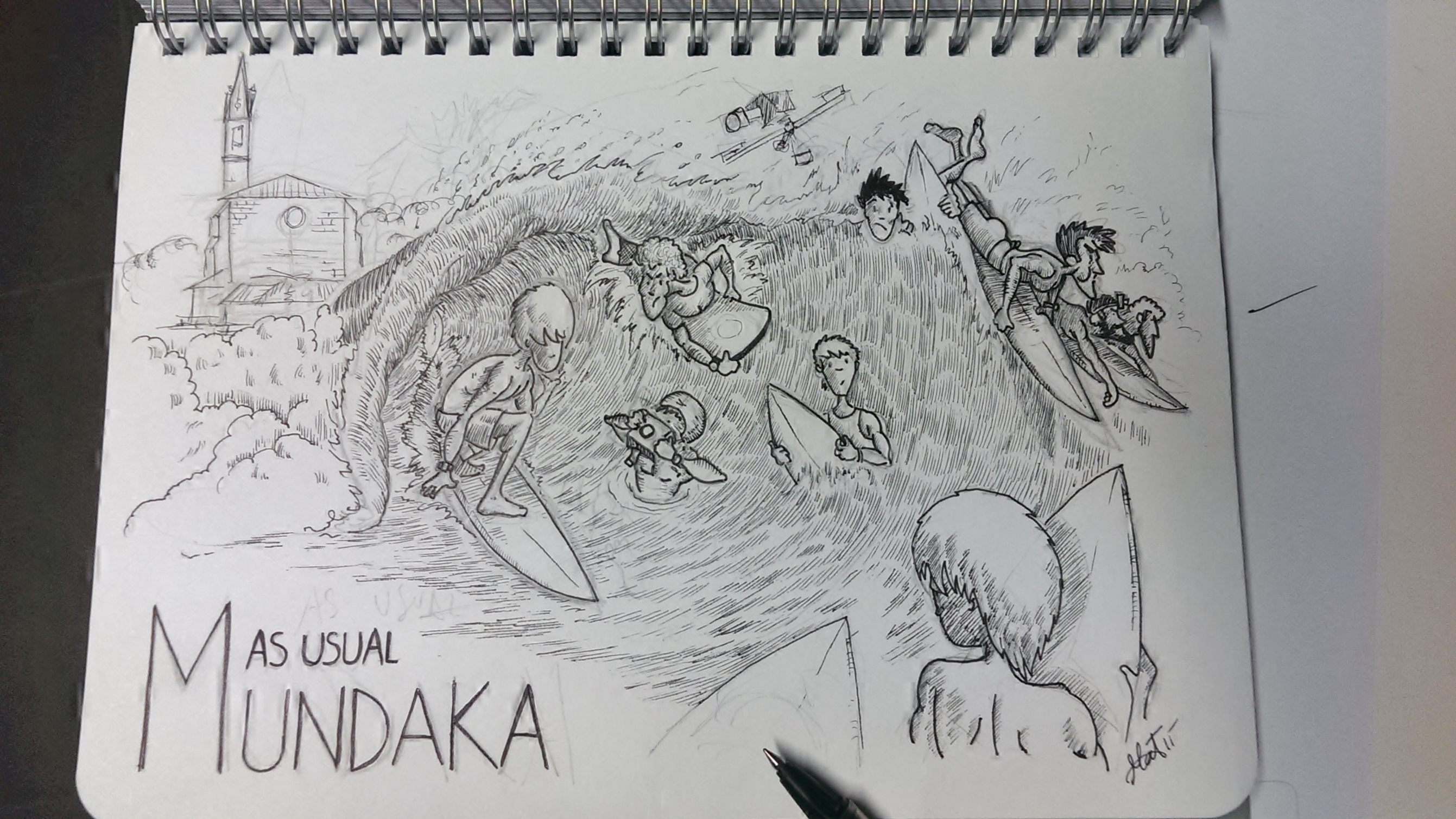
Mundaka

100 años de la botella contour, la más famosa del mundo
100 años de la botella contour, la más famosa del mundo.
Si hay una botella que ha marcado un hito en la historia del diseño de packaging esa es la botella contour, la que en su interior se oculta el refresco más famoso en todo el mundo. La botella de Coca-Cola celebra sus 100 años, hoy hacemos un repaso de su historia y quién la diseñó.

Cuánto tiene que ingresar un autónomo para ganar 938€ al mes
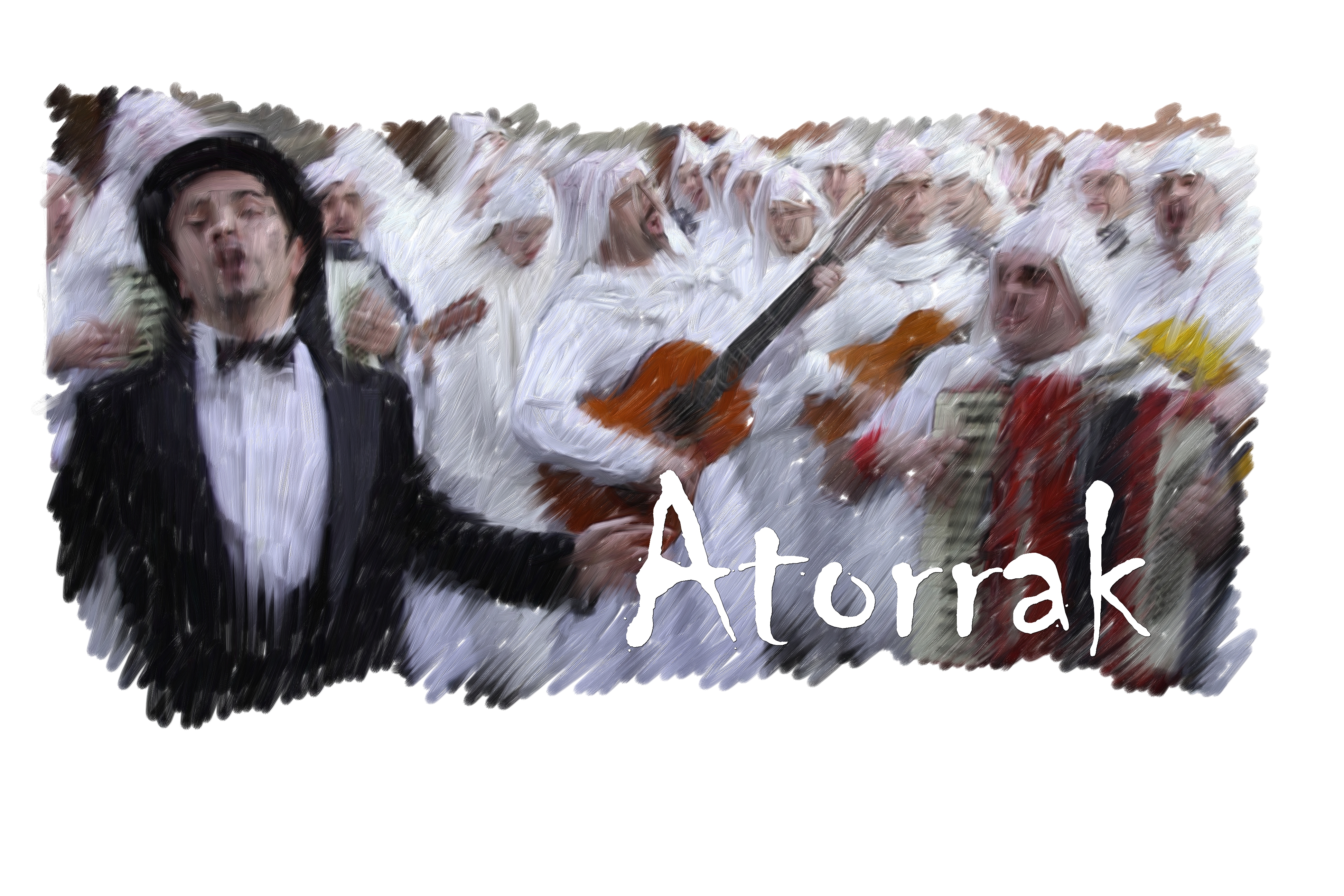
Cartel de Carnaval de Mundaka

Carnaval de Mundaka
Ya está aquí…
Aratuste (Carnaval). En Mundaka se celebran unos carnavales muy curiosos en los que participan los hombres, a los que se les llama “atorrak”, y las mujeres, llamadas “lamiak”. La indumentaria típica de los ATORRAS está constituida de falda, blusón y pantalones blancos, así como una funda de almohada a modo de capucha y pañuelo de colores. La de las LAMIAS, se compone de vestido negro, peluca
blanca, pañuelo de colores en la cabeza y el rostro maquillado. Tanto los atorras, que salen por la mañana, como las lamias, que lo hacen por la tarde, alegran las calles de Mundaka con
su buen humor, canciones y bailes.

